Built with HERE: Climate Change Performance Index 2020 Map

Interactive map visualizations are a great way to tell a data-driven story when it comes to cross-country comparisons. Upon the release of the Climate Change Performance Index (CCPI) for 2020, we wanted to showcase the report data with an interactive map. We received many requests about how we built our interactive map, so in this post, we would like to share that with you.
The following is a list of the major technologies and/or services used:
- Web client
- HERE Maps API for JavaScript
- HERE Data Hub API and Data Hub Command Line Interface (CLI)
Other relevant technologies will be highlighted throughout the post.
Preparing the data
The map visualizations are based on how each country ranked in the CCPI report. The report data contains a numerical score for each participating country. A higher score reflected greater achievements in climate protection, also resulting in a lower rank (1 being the best). Each country is categorized depending on what range the score fell in as shown here:
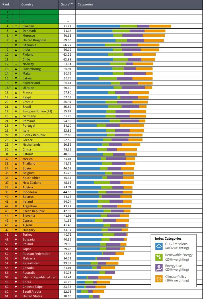
Note: No country scored high enough to be placed in the top 3 rankings.
The first task was to make the data usable with the map. We manually converted the data to a csv file with only the country name, score value, and an additional column to include the ISO 3166 Country Code (Alpha 3). Using a conversion utility, the data was then converted to a JSON format. The result of these modifications are partially shown here:
[
   { name: 'Sweden', value: 75.77, code: 'SWE' },
   { name: 'Denmark', value: 71.14, code: 'DNK' },
   { name: 'Morocco', value: 70.63, code: 'MAR' },
   { name: 'United Kingdom', value: 69.8, code: 'GBR' },
   // ...
   { name: 'Taiwan', value: 23.33, code: 'TWN' },
   { name: 'Saudi Arabia', value: 22.03, code: 'SAU' },
   { name: 'United States', value: 18.6, code: 'USA' },
];
Using the HERE Data Hub CLI, we uploaded the boundaries of every country already associated with an ISO Alpha 3 code sourced from Natural Earth Data. Once uploaded into our data hub, this provided quick access to each country's boundary by simply using the 3-character alpha code. This way we can use this data for future projects as well
The remaining task with the data is to join the data (value) in the JSON file above with each country visually on the map. That process is done in code, as we will see next.
Creating the map
The map was created using the HERE Maps API for JavaScript. When the map is loaded, it loads all the boundaries of each country (previously loaded with CLI) using the HERE Data Hub API as shown here:
async function fetchBoundaries(countryCodes) {
   const base = `https://xyz.api.here.com/hub/spaces/${credentials.id}/search?access_token=${credentials.token}`;
   const url = base + countryCodes.map((code) => `&tags=ADM0_A3@${code}`).join(',');
   const data = await jsonFetcher(url);
   return data;
}
The JSON file containing the data from the CCPI report is a resource to the web site hosting the map. It is loaded and merged with the boundaries. By merging we mean by assigning the JSON data for each country to the properties of the corresponding country in the boundaries object as shown here:
   import data from './data/data.js';

   // fetchBoundaries defined above
   const boundaries = await fetchBoundaries(countryCodes);

   const [min, max] = [Math.min(...vals), Math.max(...vals)];
   vizManager.setRange({ min, max });
   boundaries.features
      .map((x) => {
         x.properties = data.find((z) => x.properties.ADM0_A3 === z.code);
         return x;
      })
      .forEach((country) => {
         map.addObject(country);
      });
The result of this code connects all the data together: country with code, country boundary, and value of CCPI score. Each country object is then added to the map.
Styling
We styled the map with a custom YAML file as described in our documentation. Features of the page such as tool-tips and info box were styled with CSS. We consulted with this online utility for color choices. We also added a feature to make the map more interactive - when hovering over any country you will not only see the CCPI score, you will get an image of the country's flag too! We accomplished this by using this REST Countries API where the endpoint is the country code, such as https://restcountries.eu/data/usa.svg
Here is what the map looks like when hovering over the United Kingdom:
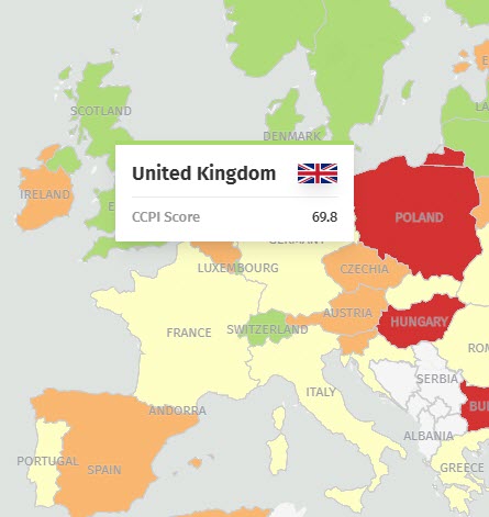
So with some simple styling touch-ups, the map is pleasantly engaging!
Summary
In this post we discussed how we built the CCPI 2020 map. We covered how we converted the data from the report and joined it with map data. We also addressed how we styled the map and made it interactive. If you are interested in building your map solutions with HERE, get started today!

Have your say
Sign up for our newsletter
Why sign up:
- Latest offers and discounts
- Tailored content delivered weekly
- Exclusive events
- One click to unsubscribe